This is part two in a series of posts about designing fireplace mantels, surrounds, tiles and other fire features with precast concrete. I hope to share with you some of my appreciation for this fantastic material that I have gained over the last fifteen years, as well as provide some tips and info for designers and homeowners who are considering designing a concrete fireplace.
When designing a fireplace with concrete, it is important to understand the role colour plays in the overall aesthetic. As with all other natural materials, concrete has its own set of unique characteristics which determine the way that it conveys colour.
As I talked about in Part One of Designing a Concrete Fireplace, concrete occupies an interesting place in the spectrum of finish materials. It lies somewhere between manufactured and naturally occurring – in many ways, it might even be called “manufactured natural.” This is due to the fact that there is not only a degree of randomness in the way that its chemical reaction occurs, but also because concrete’s formation and curing are affected by nature – that is, by the temperature and humidity present at the time it is made. Add to this that much of what we see in concrete decor is made in an artisanal fashion – under the hand of a craftsperson – and you have a fairly broad range of variables that exist in the concrete-making process. All of these variables have some impact on the concrete’s colour.
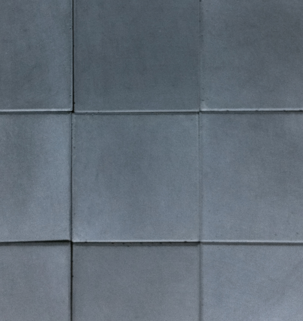
Colour in concrete should never be considered monolithic or absolute. The main reason that concrete feels ‘natural’ versus, say laminate flooring or ceramic tile, is that it has a very organic colour variation from piece to piece. Because our eyes have the ability to pick up patterns and repetition, concrete’s lack of perfect uniformity is what makes us see it as beautiful – in a natural kind of way. When designing a fireplace surround, look for the components of the surround to have subtle shade differences, but to blend harmoniously as a unit. Fireplace cladding may have slightly more variation, so when laying out fireplace tiles, ‘randomization’ is important. This ensures that the overall pattern of the colour range is balanced.
Concrete colour samples are not like paint chips. Where paint can be almost perfectly consistent from batch to batch, concrete, by nature, is not. When considering concrete colour samples in a designed space, colour variation should be taken into consideration. The variation in concrete will be in its value (relative lightness or darkness), not in its hue (its tendency towards one colour or another, i.e. blueness or redness). Colour coordinating based on hue is an entirely acceptable approach but one should always be cognizant of the fact that a product may not match a sample exactly – it will likely be slightly lighter or darker.
Concrete can be coloured in two ways: integrally/mixed in; or surface stained. These are completely different processes and at Paloform, we only do the former. In either case, though, you are generally only tinting the material and relying on some degree of concrete’s natural colour to be the ‘base.’ The range of achievable colours can be broad, depending on the types and quantities of pigments that are put into the mix, but in my opinion, concrete communicates its “concreteness” best when its greyness is allowed to show through. And for fireplace applications, the weight and solidity are conveyed beautifully when the palette is subtle.
Concrete fireplace surrounds, mantels and tiles have a very singular aesthetic in the same way that marble, oak, or other natural materials do. Although concrete can be tinted to a wide range of colours, my approach has always been to let it express its ‘concreteness.’ This means understanding that its beauty comes from its character: colour variation, mass and a rich organic aesthetic.


